Nội dung bài viết
Ăn tết đã xong, tiếp tục với series hướng dẫn cắt PSD toàn tập với Leospa phần 5 thôi nào. Ở bài trước chúng ta đã làm tới Block Quote. Hôm nay chúng ta sẽ tiếp tục với các Blocks khác như Team, Form đặt hẹn và Blog. Các bạn có thể coi hình kết quả dưới đây.
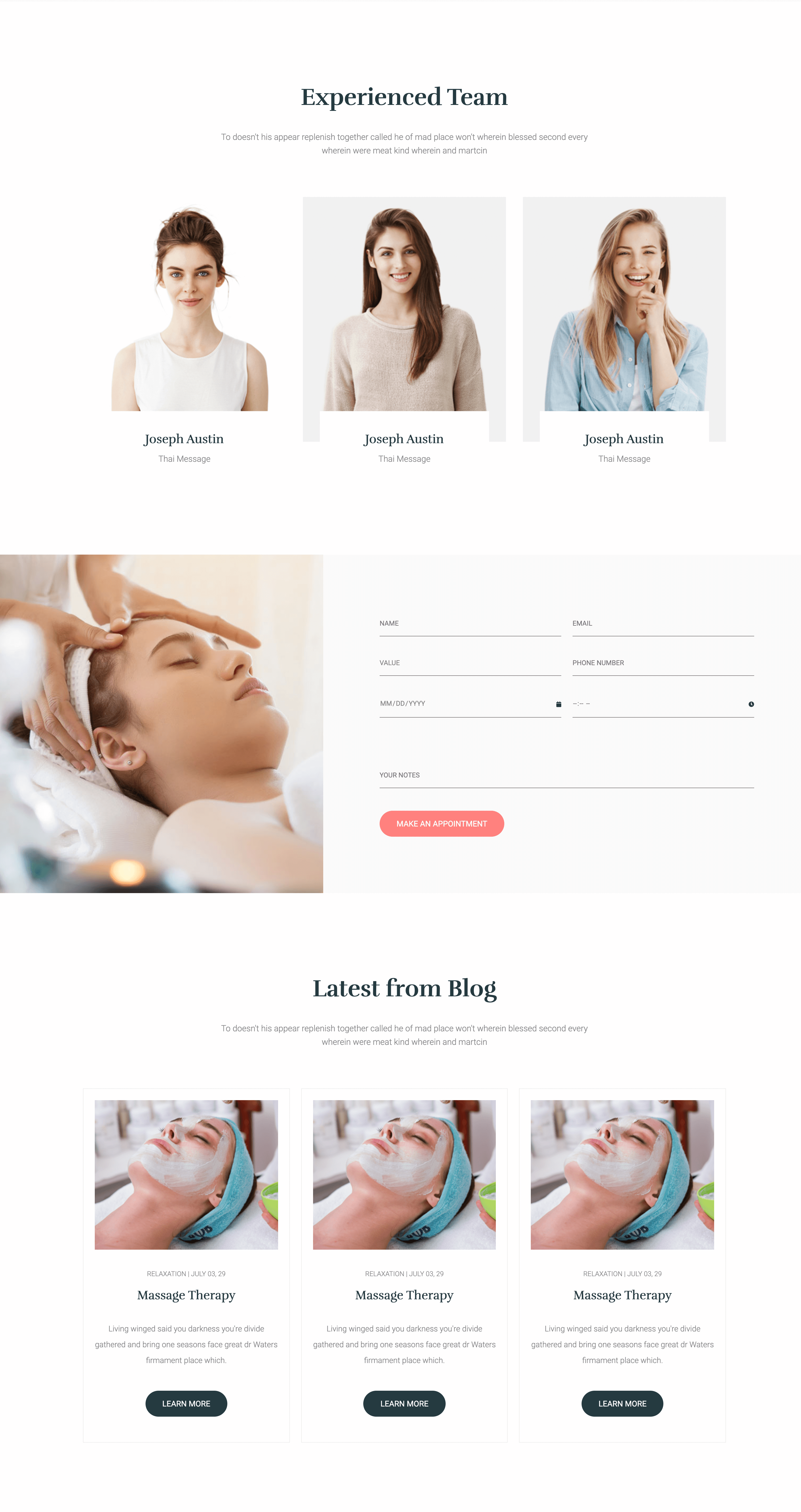
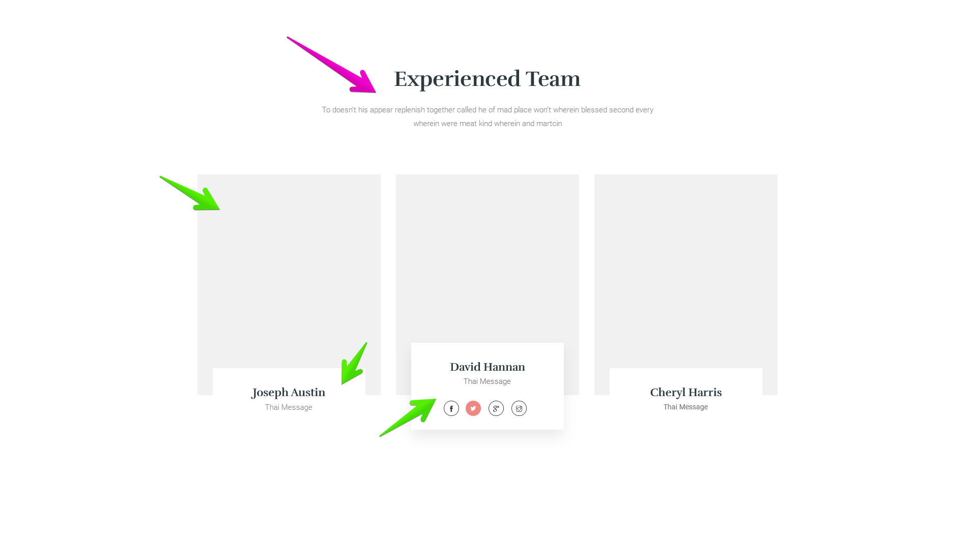
# Block Team
Nhìn vào hình ta thấy Block này cũng có tiêu đề kèm mô tả mà chúng ta đã phân tích ở những bài trước đó chính là tái sử dụng chỗ .heading. Nên ta có HTML lúc này như sau:
<section class="team">
  <div class="container">
    <div class="heading">
      <h2 class="heading__title">Experienced Team</h2>
      <p class="heading__desc">
        To doesn't his appear replenish together called he of mad place
        won't wherein blessed second every wherein were meat kind wherein
        and martcin
      </p>
    </div>
  </div>
  ... other code
</section>
Tiếp đến là danh sách các thành viên chia thành 3 cột. Trong mỗi cột thì có hình ảnh, và một khối nhỏ bên dưới chứa tên thành viên, công việc cũng như là các thông tin mạng xã hội. Các thông tin mạng xã hội thì ẩn đi, khi :hover vào thì nó mới hiện ra. Từ đây chúng ta có thể dùng ul li để chia cột, sau đó kết hợp CSS Flexbox để tạo khoảng cách giữa các phần tử với nhau. Ta có HTML lúc này như sau:
<section class="team">
  <div class="container">
    <div class="heading">
      <h2 class="heading__title">Experienced Team</h2>
      <p class="heading__desc">
        To doesn't his appear replenish together called he of mad place
        won't wherein blessed second every wherein were meat kind wherein
        and martcin
      </p>
    </div>
    <ul class="team__list">
      <li class="team__item">
        <img src="./images/10.jpg" alt="" class="team__image" />
        <div class="team__info">
          <h3 class="team__name">Joseph Austin</h3>
          <span class="team__job">Thai Message</span>
          <ul class="team__social">
            <li>
              <a href="#">
                <i class="fab fa-facebook"></i>
              </a>
            </li>
            <li>
              <a href="#">
                <i class="fab fa-twitter"></i>
              </a>
            </li>
            <li>
              <a href="#">
                <i class="fab fa-google-plus"></i>
              </a>
            </li>
            <li>
              <a href="#">
                <i class="fab fa-instagram"></i>
              </a>
            </li>
          </ul>
        </div>
      </li>
      <li class="team__item">
        <img src="./images/31.jpg" alt="" class="team__image" />
        <div class="team__info">
          <h3 class="team__name">Joseph Austin</h3>
          <span class="team__job">Thai Message</span>
          <ul class="team__social">
            <li>
              <a href="#">
                <i class="fab fa-facebook"></i>
              </a>
            </li>
            <li>
              <a href="#">
                <i class="fab fa-twitter"></i>
              </a>
            </li>
            <li>
              <a href="#">
                <i class="fab fa-google-plus"></i>
              </a>
            </li>
            <li>
              <a href="#">
                <i class="fab fa-instagram"></i>
              </a>
            </li>
          </ul>
        </div>
      </li>
      <li class="team__item">
        <img src="./images/21.jpg" alt="" class="team__image" />
        <div class="team__info">
          <h3 class="team__name">Joseph Austin</h3>
          <span class="team__job">Thai Message</span>
          <ul class="team__social">
            <li>
              <a href="#">
                <i class="fab fa-facebook"></i>
              </a>
            </li>
            <li>
              <a href="#">
                <i class="fab fa-twitter"></i>
              </a>
            </li>
            <li>
              <a href="#">
                <i class="fab fa-google-plus"></i>
              </a>
            </li>
            <li>
              <a href="#">
                <i class="fab fa-instagram"></i>
              </a>
            </li>
          </ul>
        </div>
      </li>
    </ul>
  </div>
</section>
Khoảng cách giữa các cột là 30px, vì có 3 cột nên khoảng trống sẽ là 30x2 = 60px. Từ đó độ rộng của mỗi cột sẽ là 33.33% - 20px. Ở mỗi cột sẽ có một khối nhỏ ở dưới cùng như mình đã phân tích HTML ở trên, chúng ta sẽ dùng thuộc tính position để cho nó nằm dưới cùng, kết hợp thêm thuộc tính transform: translate để đẩy nó xuống.
Sau đó khi :hover vào thì đẩy nó lên và cho thêm box-shadow vào như hình, kết hợp thêm thuộc tính transition để nó được chuyển động mượt mà hơn. Chỗ Social thì chúng ta sẽ cho ẩn đi, khi :hover mới cho hiện lên lại bằng cách dùng thuộc tính opacity kết hợp với visibility. Từ đây ta có CSS thần thánh như sau:
.team {
  padding-top: 14rem;
  padding-bottom: 20rem;
  background-color: #fff;
}
.team__list {
  display: flex;
  justify-content: space-between;
  flex-flow: row wrap;
}
.team__item {
  width: calc(33.33% - 2rem);
  position: relative;
}
.team__info {
  background-color: #fff;
  padding: 3.5rem 4.5rem 2.5rem;
  text-align: center;
  position: absolute;
  bottom: 0;
  left: 3rem;
  right: 3rem;
  transform: translateY(70%); // translate block info
  transition: transform 0.2s linear;
}
.team__name {
  font-family: var(--secondary-font);
  font-size: 2.2rem;
  margin-bottom: 1rem;
}
.team__job {
  font-size: 1.5rem;
  font-weight: 300;
  color: var(--gray-light);
}
.team__social {
  margin-top: 3rem;
  display: flex;
  justify-content: center;
  // ẩn social
  opacity: 0;
  visibility: hidden;
  transition: 0.2s linear;
}
.team__social li {
  width: 3rem;
  height: 3rem;
  border-radius: 3rem;
  margin: 0 7.5px;
  flex-shrink: 0;
}
.team__social a {
  width: 100%;
  height: 100%;
  display: flex;
  justify-content: center;
  align-items: center;
  color: var(--gray-dark);
  border: 1px solid;
  border-radius: inherit;
  transition: 0.2s linear;
}
// sự kiện :hover ở đây
.team__social a:hover {
  color: white;
  background-color: var(--primary-color);
  border-color: var(--primary-color);
}
.team__item:hover .team__info {
  transform: translateY(25%);
  box-shadow: 0 4px 4px 4px rgba(0, 0, 0, 0.025);
}
.team__item:hover .team__social {
  opacity: 1;
  visibility: visible;
}
Một điểm lưu ý là khi xuống màn hình nhỏ hơn như Tablet chẳng hạn thì chỗ Social các Icon không đủ độ rộng sẽ bị bóp lại, là vì thuộc tính flex-shrink: 1 (mặc định) trong flexbox nó làm cho các phần tử có thể thu lại khi chiều rộng không đủ. Tuy nhiên ở thiết kế này, mình co màn hình lại thì thấy các icon này vẫn đủ chỗ cho nên mình set cho nó chỗ .team__social li là flex-shrink: 0 tức là không cho phép thu lại mà luôn cố định width: 30px như đã CSS.
Về Responsive thì khi xuống Mobile mình sẽ cho các cột nằm hàng dọc bằng việc set width: 100%, và cách nhau một chút bằng margin-bottom: 3rem. Do ở thằng cha là .team__list mình có set flex-wrap: wrap rồi nên nó sẽ tự động xuống hàng khi không đủ chỗ.
Riêng khối màu trắng ở các cột mình đưa về transform bình thường để nó nằm yên và hiển thị luôn, vì ở mobile là chỉ có touch chứ không có hover nên làm vậy cho nhanh. Lúc này ta có CSS như sau:
@media screen and (max-width: 767px) {
  .team__social {
    opacity: 1;
    visibility: visible;
  }
  .team__info {
    bottom: 3rem;
    transform: translateY(0);
  }
  .team__item {
    width: 100%;
    margin-bottom: 3rem;
  }
  .team__item:hover .team__info {
    transform: none;
  }
  .team__item img {
    width: 100%;
    object-fit: cover;
  }
}
# Block Form
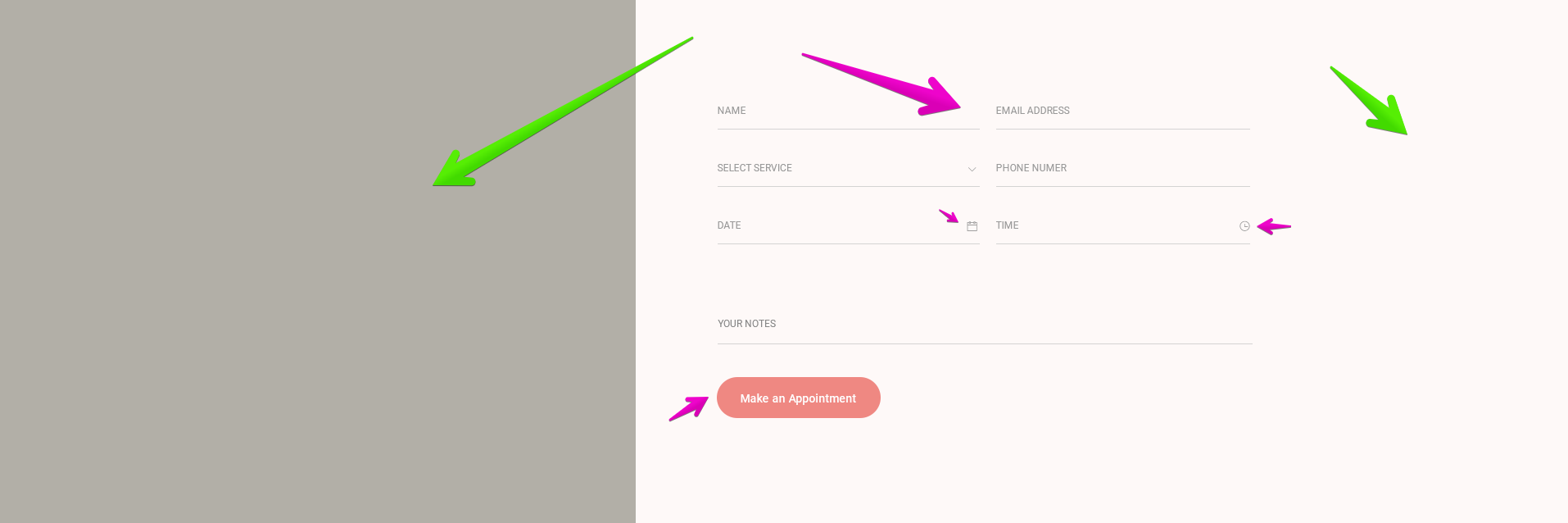
Ở Block này thì thấy rõ ràng có hai cột tương ứng 40% 60%. Bên trái là một tấm hình, còn bên phải là một form đặt hẹn với các input text, email, phone cũng như là select. Và màu nền của Block này chúng ta cũng đã dùng ở Block Quote rồi nhỉ. Ta có HTML như sau:
<section class="booking">
  <div class="booking__image">
    <img src="./images/appointment-img.jpg" alt="" />
  </div>
  <div class="booking__form">
    <form action="#" autocomplete="off">
      <div class="form-group">
        <input type="text" placeholder="Name" />
        <input type="email" placeholder="Email" />
      </div>
      <div class="form-group">
        <select name="" id="">
          <option value="value">Value</option>
        </select>
        <input type="phone" placeholder="Phone number" />
      </div>
      <div class="form-group">
        <div class="custom-input">
          <input type="date" placeholder="Date" />
          <i class="fa fa-calendar"></i>
        </div>
        <div class="custom-input">
          <input type="time" placeholder="Time" />
          <i class="fa fa-clock"></i>
        </div>
      </div>
      <div class="form-single">
        <input type="text" placeholder="Your notes" />
      </div>
      <button class="btn btn--primary btn--rounded">
        Make an Appointment
      </button>
    </form>
  </div>
</section>
Block này ta thấy các input đều được chia thành 2 cột, mỗi cột 50%, riêng trường input dưới cùng thì là 100%, các input này cách nhau bên dưới khoảng 25px. Vì khi dùng select cũng như là input[type="date"] hay input[type="time"] thì mặc định có có nút mũi tên bên phải hoặc hiển thị không đúng khi chúng ta CSS cho các input bình thường như text hay email.
Cho nên chúng ta sẽ dùng CSS -webkit-appearance: none cũng như là -webkit-outer-spin-button và -webkit-inner-spin-button để ẩn chúng đi để CSS cho đồng bộ với nhau. Riêng cái date thì phải dùng thêm -webkit-calendar-picker-indicator nữa.
Ở đây mình đặt các input có độ rộng 50% nằm trong class .form-group, và dùng flexbox để chia thành 2 cột, còn cái dưới cùng thì trong class .form-single, chỗ input date và time thì có icon, cho nên mình sẽ đặt thêm một class như là .custom-input để bao lại để áp dụng position cho thẻ icon là thẻ i. Và cuối cùng là button với các class đã làm từ các blocks trước là btn btn--primary btn--rounded là xong.
.booking {
  background-color: var(--bg-block);
  display: flex;
}
.booking__image {
  width: 40%;
}
.booking__image img {
  width: 100%;
  height: 100%;
  object-fit: cover;
}
.booking__form {
  padding: 10rem;
  width: 60%;
}
.booking__form input,
.booking__form select {
  text-transform: uppercase;
  color: var(--gray-light);
  font-size: 1.2rem;
  background-color: transparent;
  padding: 1.5rem 0;
  border: 0;
  border-bottom: 1px solid currentColor;
  width: 100%;
  border-radius: 0;
  outline: none;
  -webkit-appearance: none;
  font-family: var(--primary-font);
}
// ẩn mũi tên mặc định
.booking__form input::-webkit-inner-spin-button, .booking__form input::-webkit-outer-spin-button,
.booking__form select::-webkit-inner-spin-button,
.booking__form select::-webkit-outer-spin-button {
  -webkit-appearance: none;
  margin: 0;
}
.booking .form-group {
  display: flex;
  align-items: baseline;
  justify-content: space-between;
  margin-bottom: 2.5rem;
}
// set width 50%-1rem của các phần tử trong form-group
.booking .form-group .custom-input,
.booking .form-group input,
.booking .form-group select {
  width: calc(50% - 1rem);
}
.booking .form-group .custom-input {
  position: relative;
}
// set riêng input cho custom-input
.booking .form-group .custom-input input {
  width: 100%;
}
// ẩn mũi tên cho input date
.booking .form-group .custom-input input::-webkit-calendar-picker-indicator {
  -webkit-appearance: none;
  display: none;
}
.booking .form-group .custom-input i {
  position: absolute;
  right: 0;
  top: 50%;
  transform: translateY(-50%);
  z-index: 10;
}
.booking .form-single {
  margin-top: 8rem;
  margin-bottom: 4rem;
}
Do class .custom-input bọc lại nên input bên trong input sẽ có width: calc(50% - 1rem) sẽ không đúng, cho nên mình CSS thêm cho .custom-input là width: calc(50% – 1rem) rồi sau đó set cho các input bên trong nó là width: 100% để hiển thị cho đúng nhé.
Responsive ở đây rất đơn giản, xuống màn hình nhỏ hơn cỡ như Tablet thì mình cho hiển thị hàng dọc, và set các cột về 100% hết luôn, đồng thời giảm padding ở cột form lại một chút là đẹp rồi.
@media screen and (max-width: 1023px) {
  .booking {
    flex-direction: column;
  }
  .booking > * {
    width: 100%;
  }
  .booking__form {
    padding: 2rem;
  }
}
# Block Blog
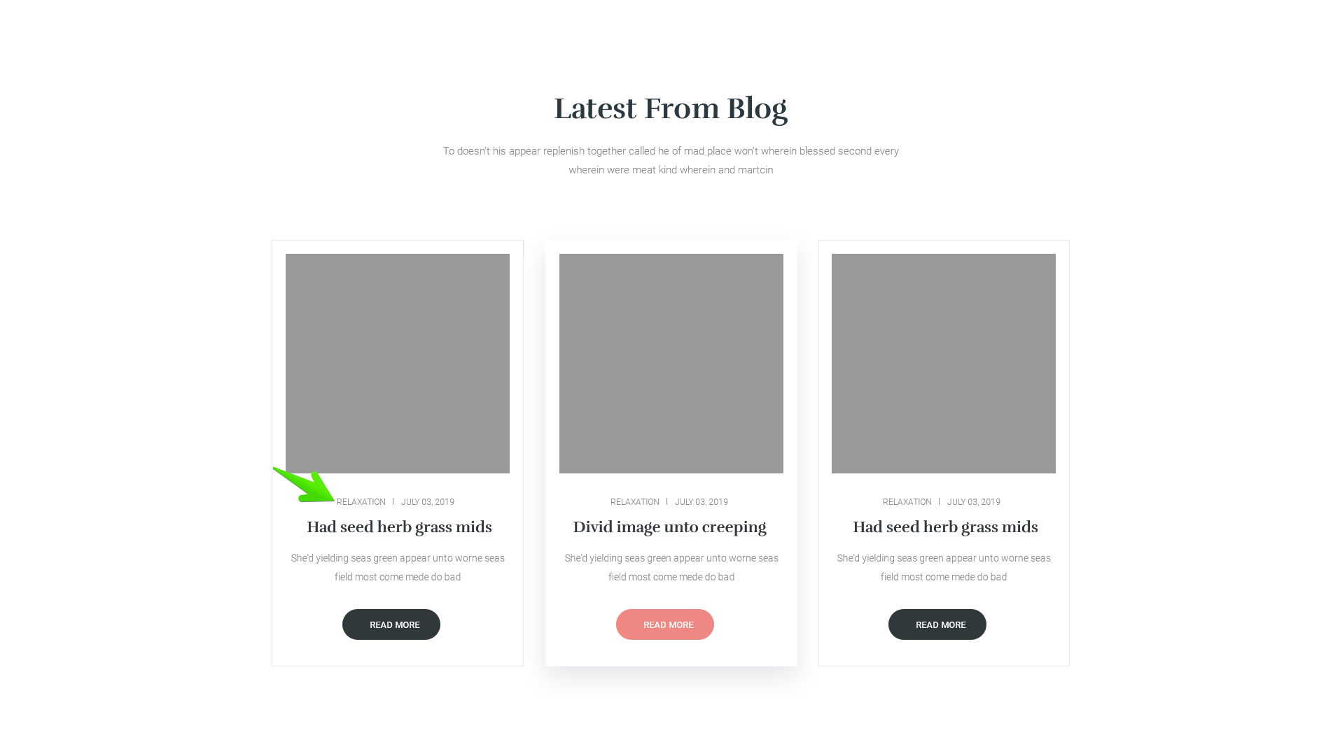
Các bạn thấy qúa quen chứ, nó y hệt Block Popular mà chúng ta đã làm ở các bài trước, đơn giản chỉ cần copy HTML xuống là xong. Rồi sau đó thêm một class .blog vào để thay đổi một chút CSS vì ở Block Blog này có thêm mục Danh mục mà mình để mũi tên ở trên.
<section class="popular blog">
  <div class="container">
    <div class="heading">
      <h2 class="heading__title">Latest from Blog</h2>
      <p class="heading__desc">
        To doesn't his appear replenish together called he of mad place
        won't wherein blessed second every wherein were meat kind wherein
        and martcin
      </p>
    </div>
    <ul class="popular__list">
      <li class="popular__item">
        <a href="#" class="popular__link">
          <img src="./images/1.jpg" alt="" />
          <p class="category">Relaxation | July 03, 29</p>
          <h3 class="title">Massage Therapy</h3>
          <p class="desc">
            Living winged said you darkness you're divide gathered and
            bring one seasons face great dr Waters firmament place which.
          </p>
          <button class="btn btn--secondary btn--rounded">
            Learn more
          </button>
        </a>
      </li>
    </ul>
  </div>
</section>
Mọi thứ giao diện đã có từ Block Popular, riêng chỗ Blog này thì có cái danh mục thêm vô cho nên mình sẽ CSS lại cũng như thêm vào một chút là xong.
.blog .popular__link .title {
  margin-top: 1.5rem;
}
.blog .category {
  text-transform: uppercase;
  color: var(--gray-light);
  margin-top: 3.5rem;
  font-size: 1.2rem;
}
# Tạm kết
Như vậy là đã xong. Đừng quên tham khảo code của mình tại đây nhé. Chúc các bạn một ngày tốt lành. Nếu không hiểu hay có góp ý gì thì đừng ngại mà bình luận nhé..
Awesome post! Keep up the great work! 🙂
Thank you so so much
Thanks
Em thấy thẻ i để anh thêm calendar và clock nó không giống mẫu PSD lắm
Mà em thấy nếu để bt thì nó hiện vẫn OK mà anh