
Nội dung bài viết
Từ trước tới giờ mình tùy biến VSCode rất nhiều và cũng có nhiều người hỏi về các đoạn code tùy biến đó, người này hỏi, người kia hỏi cho nên mình viết luôn bài này tổng hợp code những cái tùy biến đấy cho các bạn luôn
Trước khi mà các bạn có thể áp dụng được những đoạn code này vào thì các bạn cần xem video này trên kênh Youtube của mình để có thể hiểu cách làm nhé.
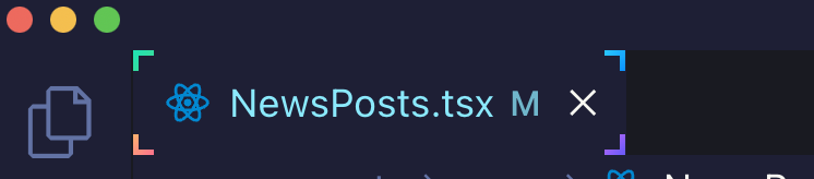
Tùy biến active tab 4 góc
:root{
--size: 5px;
}
.monaco-workbench
  .part.editor
  > .content
  .editor-group-container
  > .title
  .tabs-container
  > .tab.active.tab-border-top
  > .tab-border-top-container {
  width: 100%;
  height: 100%;
  top: 0;
  left: 0;
  background-color: transparent;
}
.monaco-workbench
  .part.editor
  > .content
  .editor-group-container
  > .title
  .tabs-container
  > .tab.active.tab-border-top
  > .tab-border-top-container:before,
.monaco-workbench
  .part.editor
  > .content
  .editor-group-container
  > .title
  .tabs-container
  > .tab.active.tab-border-top
  > .tab-border-top-container:after {
  content: "";
  width: var(--size);
  height: var(--size);
  position: absolute;
  border: 2px solid;
  border-image-slice: 1;
}
.monaco-workbench
  .part.editor
  > .content
  .editor-group-container
  > .title
  .tabs-container
  > .tab.active.tab-border-top
  > .tab-border-top-container:before {
  top: 0;
  left: 0;
  border-right: 0;
  border-bottom: 0;
  border-image-source: linear-gradient(-45deg, #4dd78a, #20e3b2);
}

.monaco-workbench
  .part.editor
  > .content
  .editor-group-container
  > .title
  .tabs-container
  > .tab.active.tab-border-top
  > .tab-border-top-container:after {
  right: 0;
  bottom: 0;
  border-top: 0;
  border-left: 0;
  border-image-source: linear-gradient(-45deg, #6a5af9, #d66efd);
}
.monaco-workbench
  .part.editor
  > .content
  .editor-group-container
  > .title
  .tabs-container
  > .tab.active:before,
.monaco-workbench
  .part.editor
  > .content
  .editor-group-container
  > .title
  .tabs-container
  > .tab.active:after {
  content: "";
  width: var(--size);
  height: var(--size);
  position: absolute;
  border: 2px solid;
  border-image-slice: 1;
}
.monaco-workbench
  .part.editor
  > .content
  .editor-group-container
  > .title
  .tabs-container
  > .tab.active:before {
  left: 0;
  bottom: 0;
  border-top: 0;
  border-right: 0;
  border-image-source: linear-gradient(-45deg, #fc6c8f, #ffb86c);
}

.monaco-workbench
  .part.editor
  > .content
  .editor-group-container
  > .title
  .tabs-container
  > .tab.active:after {
  top: 0;
  right: 0;
  border-left: 0;
  border-bottom: 0;
  border-image-source: linear-gradient(-45deg, #098dff, #2cccff);
}
Lưu ý: Ở đoạn code trên các bạn sẽ thấy đoạn .tab-border-top thì tùy vào theme, ví dụ theme Dracula sẽ có border-top nhưng một số theme khác thì lại có border-bottom nên class của theme khác có thể là .tab-border-bottom. Cho nên các bạn linh động thay class phù hợp là chạy ổn áp nha
Tùy biến active tab line gradient
Sử dụng đoạn code này thì khi active tab sẽ có một đường line ở trên cái tab khi mà nó active trong VSCode và nó sẽ chạy qua chạy lại với nhiều màu sắc cho các bạn.
Lưu ý: Cũng tương tự như ở trên thì tùy thuộc vào theme thì sẽ có .tab-border-top hoặc .tab-border-bottom. Các bạn chỉ cần thay vào là chạy đúng kết quả các bạn muốn thôi nhé.
.monaco-workbench
  .part.editor
  > .content
  .editor-group-container
  > .title
  .tabs-container
  > .tab.active.tab-border-top
  > .tab-border-top-container {
  background-size: 400% 400%;
  background-image: linear-gradient(
    -45deg,
    #fc6c8f,
    #ff2ced,
    #ffb86c,
    #2cccff,
    #20e3b2,
    #ffcc70,
    #c850c0,
    #4158d0
  );
  animation: gradient 5s ease alternate infinite;
  height: 3px;
}
@keyframes gradient {
  0% {
    background-position: 0% 50%;
  }
  50% {
    background-position: 100% 50%;
  }
  100% {
    background-position: 0% 50%;
  }
}
Tùy biến font chữ cho các class
Nhiều bạn hỏi mình sao làm cho chỗ này nó có font chữ khác thì mình cũng chia sẻ cho các bạn luôn. Đầu tiên các bạn cần tải font Dank Mono và cài đặt cho máy tính của các bạn tại đây
Sau khi tải và cài đặt xong cho máy tính rồi thì áp dụng đoạn code này vào là được
.mtk5,
.mtk26 {
  -webkit-font-smoothing: auto;
  font-family: "Dank mono", monospace;
}
.mtk26 {
  font-style: italic;
}
Hãy lưu ý rằng hai class .mtk5 và .mtk26 là tương ứng cho theme mình đang xài(Evondev Dracula), nếu các bạn xài theme khác thì tự tìm class nhé vì mỗi theme thì class nó khác nhau. Tìm như thế nào thì coi video ở trên cùng. Mình đã chỉ tận răng rồi cho nên mấy vấn đề này mình không có hỗ trợ riêng đâu nhé.
Nếu làm theo vẫn chưa được thì có thể tham khảo thêm đoạn code dưới đây, đoạn này bỏ vào trong file settings.json của các bạn nhé. Trong đó Evondev Dracula Normal Contrast là tên theme của các bạn
"[Evondev Dracula Normal Constrast]": {
  "textMateRules": [
    {
      "scope": [
        "entity.other.attribute-name.js",
        "entity.other.attribute-name.jsx",
        "entity.other.attribute-name.ts",
        "entity.other.attribute-name.tsx",
        "entity.other.attribute-name.html",
        "entity.other.attribute-name.pug"
      ],
      "settings": {
        "foreground": "#20e4b2"
      }
    }
  ]
}
Đoạn tùy chỉnh JSON ở trên mục đích là tách cái thuộc tính(attribute) trong thẻ HTML thành một scope riêng biệt để nó sinh ra một class mới như .mtk26 chẳng hạn rồi dựa vào class đó tùy biến màu khác, in nghiêng… tùy vào mục đích mỗi người.
Tùy biến con trỏ
.cursors-layer .cursor {
  background-image: linear-gradient(
    245deg,
    #fcb564,
    #ff65f2,
    #d66efd
  ) !important;
}
Bo góc Tab
.tabs-container > .tab {
  border-right: 0 !important;
}
.tabs-and-actions-container {
  padding: 4px !important;
}

.tabs-container {
  gap: 8px !important;
}
.tabs-container > .tab.active.tab-border-top > .tab-border-top-container {
  --general-gradient-secondary: #fcb564, #ff65f2, #ff69cf;
  height: 0.5px !important;
  background-image: linear-gradient(
    to right,
    var(--general-gradient-secondary)
  );
  width: 50% !important;
  left: 50% !important;
  transform: translate3d(-50%, 0%, 0) !important;
  top: -1px !important;
}
.tabs-container > .tab {
  border-radius: 100px;
  border-color: rgba(255, 255, 255, 0.12) rgb(25, 26, 33)
    rgba(255, 255, 255, 0.12) rgba(255, 255, 255, 0.12);
  border-style: solid;
  border-width: 1px 0 0 0;
}
Border gradient
.monaco-workbench
  .part.editor
  > .content
  .editor-group-container
  > .title
  .tabs-container {
  padding: 8px;
  gap: 8px;
}
.monaco-workbench
  .part.editor
  > .content
  .editor-group-container
  > .title
  .tabs-container
  > .tab.sizing-fit {
  background-color: #21222c !important;
  border-radius: 4px;
}
.tab.tab-actions-right.sizing-fit.has-icon.tab-border-top.active .tab-label {
  position: relative;
}
.tab.tab-actions-right.sizing-fit.has-icon.tab-border-top.active:before {
  content: "";
  position: absolute;
  background: #21222c;
  top: 50%;
  left: 50%;
  width: calc(100% - 2px);
  height: calc(100% - 2px);
  border-radius: inherit;
  transform: translate(-50.1%, -50.1%);
  border-radius: inherit;
}
.monaco-workbench
  .part.editor
  > .content
  .editor-group-container
  > .title
  .tabs-container
  > .tab.sizing-fit.active {
  background-image: linear-gradient(
    45deg,
    #fcb564,
    #ff65f2,
    #d66efd,
    #6a5af9,
    #2cccff,
    #20e3b2
  );
}
/* hide border top */
.monaco-workbench
  .part.editor
  > .content
  .editor-group-container
  > .title
  .tabs-container
  > .tab.active.tab-border-top
  > .tab-border-top-container {
  display: none !important;
}
Neon line rounded animation(New)
:root {
  --tab-gradient: #407cff 318deg, #da8bff 1turn;
  --size: 1.3px;
  --duration: 5s;
  --general-gradient-secondary: #fcb564, #ff65f2, #ff69cf;

}
.tab-border-top-container {
  -webkit-mask: linear-gradient(#fff 0 0) content-box, linear-gradient(#fff 0 0);
  mask: linear-gradient(#fff 0 0) content-box, linear-gradient(#fff 0 0);
  mask-composite: xor;
  -webkit-mask-composite: xor;
  mask-composite: exclude;
  padding: var(--size);
  width: 100% !important;
  height: calc(100% - 1px) !important;
  background-color: transparent !important;
  border-radius: inherit;
  box-sizing: border-box;
}
.tab-border-top-container:before {
  content: "";
  width: 300px;
  height: 300px;
  position: absolute;
  left: 50%;
  top: 50%;
  transform: translate(-50%, -50%);

  animation: spinner var(--duration) cubic-bezier(0.175, 0.885, 0.32, 1.275)
    infinite;
  background: conic-gradient(
      from 0deg at 50% 51.35%,
      rgba(185, 215, 243, 0) 0deg,
      rgba(185, 215, 243, 0) 289.4deg,
      var(--tab-gradient)
    ),
    conic-gradient(
      from 180deg at 50% 51.35%,
      rgba(185, 215, 243, 0) 0deg,
      rgba(185, 215, 243, 0) 287.46deg,
      var(--tab-gradient)
    );
  border-radius: inherit;
}
@keyframes spinner {
  100% {
    transform: translate(-50%, -50%) rotate(1turn);
  }
}

.tab {
  overflow: hidden;
}
.tab.active {
  border-radius: 100px !important;
  box-shadow: inset 0 1px 1px 0 rgba(199, 211, 234, 0.12),
    inset 0 24px 48px 0 rgba(199, 211, 234, 0.05),
    0 24px 32px 0 rgba(6, 6, 14, 0.7);
}
Dành cho ai dùng theme Evondev Dracula
Đây là toàn bộ code tùy biến hiện tại của mình, nếu bạn thích thì có thể copy vào hết là y hệt mình, tuy nhiên nếu bạn đang dùng máy có độ phân giải cao thì nó sẽ đẹp hơn nhé, ví dụ như Macbook chẳng hạn
:root {
  --gradient-dir1: to top right;
  --gradient-dir2: to bottom left;
  --gradient-dir3: to right top;
  --gradient-dir4: to left bottom;
  --gradient-dir5: to top left;
  --size: 5px;
}
.mtk10,
.mtk15 {
  color: transparent;
  background-image: linear-gradient(var(--gradient-dir4), #fc806c, #ff1bd1);
  -webkit-background-clip: text;
  background-clip: text;
  -webkit-text-fill-color: transparent;
}

.mtk5,
.mtk26 {
  color: transparent;
  background-image: linear-gradient(
    var(--gradient-dir1),
    #4dd78a,
    #20e3b2,
    #a2de6a
  );
  background-clip: text;
  -webkit-text-fill-color: transparent;
  -webkit-background-clip: text;
  -webkit-font-smoothing: auto;
  font-family: "Dank mono", monospace;
  font-size: 14px;
}
.mtk26 {
  background-image: linear-gradient(
    var(--gradient-dir5),
    #4dd78a,
    #20e3b2,
    #a2de6a
  );
  font-style: italic;
}
.mtk23,
.mtk16 {
  color: transparent;
  background-image: linear-gradient(var(--gradient-dir1), #d66efd, #6a5af9);
  background-clip: text;
  -webkit-text-fill-color: transparent;
  -webkit-background-clip: text;
}
.mtk9,
.mtk17 {
  color: transparent;
  background-image: linear-gradient(
    var(--gradient-dir2),
    #098dff,
    #2cccff,
    #2979ff
  );
  background-clip: text;
  -webkit-text-fill-color: transparent;
  -webkit-background-clip: text;
}
.mtk18 {
  color: transparent;
  background-image: linear-gradient(var(--gradient-dir2), #b0beff, #fed9ff);
  background-clip: text;
  -webkit-text-fill-color: transparent;
  -webkit-background-clip: text;
  font-style: normal;
}
.mtk3 {
  color: transparent;
  /* background-image: linear-gradient(
    var(--gradient-dir1),
    #c29ffd,
    #ffb4dc,
    #e39bf7
  ); */
  background-image: linear-gradient(to top, #fce1d0, #ffadd6, #e39bf7);
  background-clip: text;
  -webkit-text-fill-color: transparent;
  -webkit-background-clip: text;
}
.mtk7 {
  color: transparent;
  background-image: linear-gradient(var(--gradient-dir2), #fc6c8f, #ffb86c);
  -webkit-background-clip: text;
  background-clip: text;
  -webkit-text-fill-color: transparent;
}
.mtk8,
.mtk14 {
  color: transparent;
  background-image: linear-gradient(to right, #ffb88c, #eac394);
  -webkit-background-clip: text;
  background-clip: text;
  -webkit-text-fill-color: transparent;
}

.monaco-workbench
  .activitybar
  > .content
  :not(.monaco-menu)
  > .monaco-action-bar
  .action-item.checked
  .active-item-indicator:before {
  border: 0;
  width: 3px;
  height: 100%;
  position: absolute;
  top: 0;
  left: 0;
  background-image: linear-gradient(45deg, #fc6c8f, #ff2ced);
}

.monaco-workbench
  .activitybar
  > .content
  :not(.monaco-menu)
  > .monaco-action-bar
  .badge
  .badge-content {
  background-image: linear-gradient(45deg, #fc6c8f, #ff2ced);
}
.monaco-editor .cursors-layer .cursor {
  background-image: linear-gradient(to top, #6a5af9, #d66efd, #fc6c8f, #ff2ced);
}

.mtki {
  font-style: normal;
}

.monaco-workbench
  .part.editor
  > .content
  .editor-group-container
  > .title
  .tabs-container
  > .tab.active.tab-border-top
  > .tab-border-top-container {
  width: 100%;
  height: 100%;
  top: 0;
  left: 0;
  background-color: transparent;
}
.monaco-workbench
  .part.editor
  > .content
  .editor-group-container
  > .title
  .tabs-container
  > .tab.active.tab-border-top
  > .tab-border-top-container:before,
.monaco-workbench
  .part.editor
  > .content
  .editor-group-container
  > .title
  .tabs-container
  > .tab.active.tab-border-top
  > .tab-border-top-container:after {
  content: "";
  width: var(--size);
  height: var(--size);
  position: absolute;
  border: 2px solid;
  border-image-slice: 1;
}
.monaco-workbench
  .part.editor
  > .content
  .editor-group-container
  > .title
  .tabs-container
  > .tab.active.tab-border-top
  > .tab-border-top-container:before {
  top: 0;
  left: 0;
  border-right: 0;
  border-bottom: 0;
  border-image-source: linear-gradient(-45deg, #4dd78a, #20e3b2);
}

.monaco-workbench
  .part.editor
  > .content
  .editor-group-container
  > .title
  .tabs-container
  > .tab.active.tab-border-top
  > .tab-border-top-container:after {
  right: 0;
  bottom: 0;
  border-top: 0;
  border-left: 0;
  border-image-source: linear-gradient(-45deg, #6a5af9, #d66efd);
}
.monaco-workbench
  .part.editor
  > .content
  .editor-group-container
  > .title
  .tabs-container
  > .tab.active:before,
.monaco-workbench
  .part.editor
  > .content
  .editor-group-container
  > .title
  .tabs-container
  > .tab.active:after {
  content: "";
  width: var(--size);
  height: var(--size);
  position: absolute;
  border: 2px solid;
  border-image-slice: 1;
}
.monaco-workbench
  .part.editor
  > .content
  .editor-group-container
  > .title
  .tabs-container
  > .tab.active:before {
  left: 0;
  bottom: 0;
  border-top: 0;
  border-right: 0;
  border-image-source: linear-gradient(-45deg, #fc6c8f, #ffb86c);
}

.monaco-workbench
  .part.editor
  > .content
  .editor-group-container
  > .title
  .tabs-container
  > .tab.active:after {
  top: 0;
  right: 0;
  border-left: 0;
  border-bottom: 0;
  border-image-source: linear-gradient(-45deg, #098dff, #2cccff);
}
Tạm kết
Trên đây là toàn bộ source code tùy biến hiện tại của mình. Hi vọng bài viết ngắn gọn súc tích này sẽ có ích cho các bạn. Giúp các bạn có cảm hứng khi coding hơn.


s e link thành côg file r mà nó k có gì thay đổi hết v a
Quan trọng là chỗ đường dẫn tuyệt đối bạn dẫn đúng không
A ơi e link thành công, cũng thay đổi font thành “Dank Mono” đủ cả tại sao lại không có thay đổi gì a nhỉ?
Chắc là bạn chưa bấm cmd/ctrl + shift + p, rồi tra và ấn “enable js and css…”, tải lại rồi ấn tiếp cmd/ctrl + shift + p rồi ấn checksum restore và nhấn rồi ấn tiếp checksum apply rồi tải lại sẽ có kết quả (nếu bạn đã tải extension enable css and js Loader và fix vscode checksum nhé)
bn bt lm sao để có font chữ linear như ảnh k
bạn phải sử dụng được reload custom css
Sao em copy hết nó áp dụng được hết nhưng con trỏ chuột bị thuộc tính backgroundimage đè và ko thấy con trỏ chuột ở đâu, anh biết cách fix ko ạ
Em phải hiểu về CSS thì em mới làm tốt được nè. Em bật vscode f12 lên check class .cursor là rõ thôi em
bẠN THỬ RELOAD custom css lại nếu vẫn bị vậy check lại từng dòng code
Yeah! Em đã thành công rồi anh ơi!
bạn teamview chỉ mình với được ko bạn ơi
anh ơi anh cập nhật thêm code mới đi anh, chỗ file mà nó có border radius nhìn đẹp quá ạ
oke em nha
Đã cập nhật rồi nha
Anh đã thêm rồi nha
ôi em cảm ơn anh nhiều
Trên window làm kiểu gì vậy anh ?
window làm bình thường thôi bạn, như nhau cả
Bạn có thể update custom mới nhất của bạn được không, custom mới nhất của bạn thật sự rất đẹp. Cảm ơn bạn
Oke mình sẽ cập nhật sớm